Imagine the Monday leadership meeting. The CEO wants to know whether the product team is actually moving the business forward, the COO wants to know what’s slipping, and the head of engineering is already bracing for a debate about why “busy” didn’t turn into “done.” That’s the moment when an executive product dashboard either earns its place or gets ignored.
A good executive dashboard isn’t a prettier sprint report. It’s a decision tool. It should help leadership answer three simple questions fast: Are we shipping at a healthy pace, are we making real progress against the roadmap, and is the team in good enough shape to keep going without breaking something important?
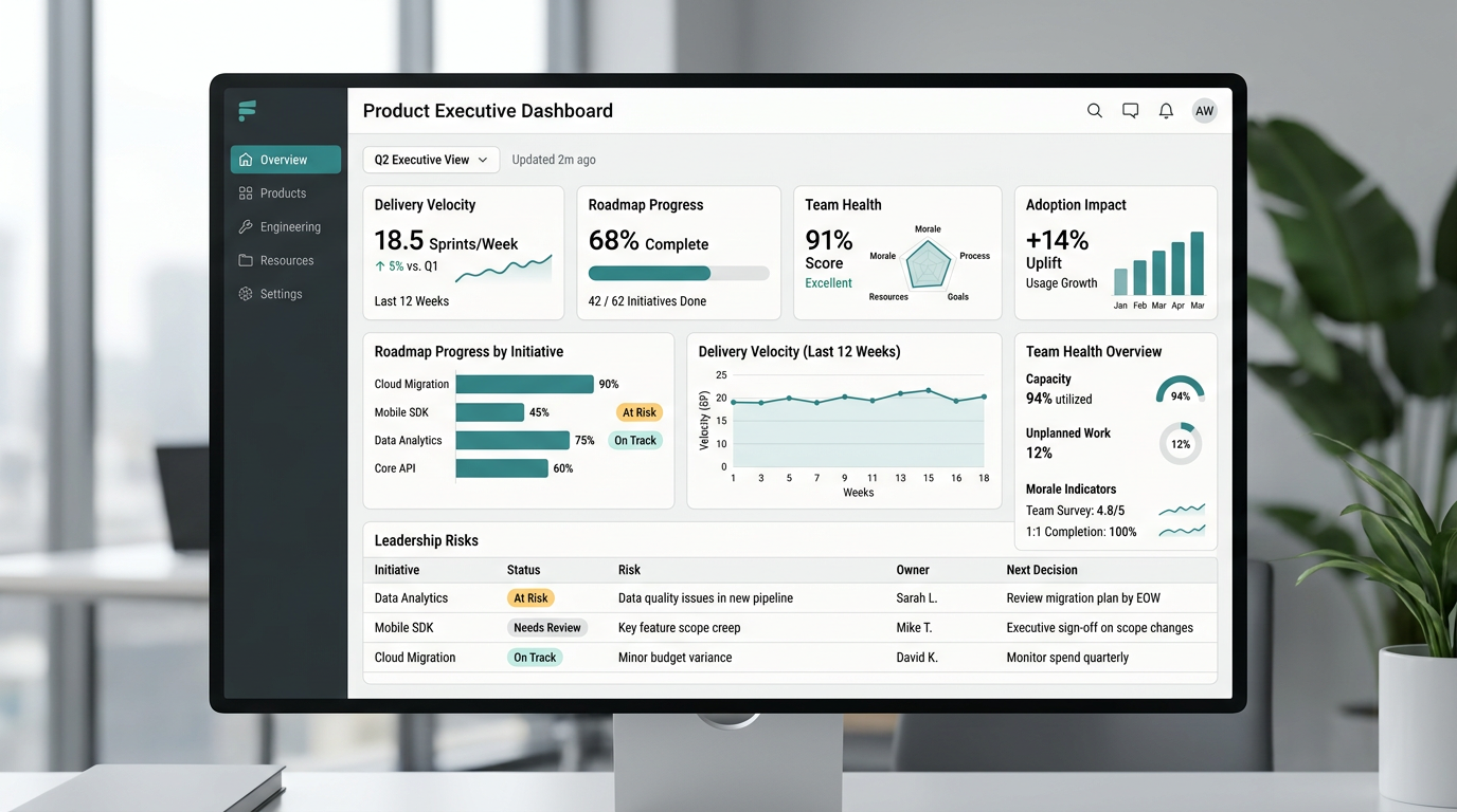
That’s why the best dashboards don’t dump every product metric onto one screen. They connect product work to business goals, show progress against plan, and surface the risks that need attention before they turn into surprises. Product roadmaps work best when they act as a shared source of truth for vision, priorities, and progress, which is exactly why your dashboard should make roadmap movement visible to leadership instead of hiding it inside team tools.
The first metric every executive dashboard should track is delivery velocity. Not because leaders need to obsess over story points, they don’t, but because they need a clean read on whether the machine is moving at a steady speed. Development dashboards commonly track story points per sprint, cycle time, sprint goal achievement, and carryover work because those signals show whether delivery is stable or whether planning is falling apart under the surface.
Velocity matters most when you show it in context. A rising line means very little if quality is collapsing. A flat line can actually be healthy if the team is working through larger, more strategic bets. What executives need is a trend, not a raw number. Show planned versus completed work, sprint goal hit rate, and carryover over the last six to twelve weeks, and you’ve already done more than most dashboards that try to impress people with noise.
The second metric is lead time, or the time it takes for work to move from commitment to customer impact. This is where delivery speed becomes real. DORA defines lead time for changes and deployment frequency as two of the core measures of software delivery performance, alongside change failure rate and mean time to recovery.
Why does this matter at the executive level? Because a team that “ships a lot” can still be painfully slow at turning decisions into outcomes. If it takes six weeks to move a validated priority from ready to production, leadership should know that. If deploys are frequent but customer-facing impact is delayed by approvals, QA bottlenecks, or release coordination, leadership should know that too. That’s how you stop dashboards from becoming vanity mirrors.
The third metric is roadmap progress, and this is where most executive dashboards either become useful or totally lose the room. Leaders don’t want a color-coded graveyard of initiatives with vague labels like “in progress.” They want to know what is on track, what is late, what shipped, what changed, and what’s blocked. Effective roadmap reporting typically includes status, timelines, completed work, dependencies, and roadblocks because progress without context doesn’t help anyone make a decision.
This metric should answer a very practical question: how much of the committed roadmap for the quarter or half is still realistically attainable? Not “how many tickets moved.” Not “how hard everyone worked.” Just: are we going to land what we said mattered most? If the answer is no, the dashboard should make the why painfully obvious. A dashboard that hides slippage until the quarterly review isn’t a dashboard, it’s a delay mechanism.
The fourth metric is outcome impact. This is the one that keeps the dashboard from turning into an operations report with better colors. A strong product dashboard should balance leading indicators, like feature adoption and engagement, with lagging indicators, like revenue impact, ROI, churn, or satisfaction, because leaders need to see both what is happening now and whether it’s turning into business results later.
This is also where product teams earn executive trust. If a dashboard can show that a roadmap item was delivered, adopted, and tied to a meaningful business goal, the conversation changes. Now the team isn’t defending output. It’s showing impact. And once leadership sees that connection consistently, product stops sounding like a cost center and starts sounding like strategy.
The fifth metric is quality and reliability. Shipping faster only looks impressive right up until it creates a mess. Change failure rate and mean time to recovery are two of the clearest ways to show whether speed is coming at the expense of stability, and they sit at the center of the DORA framework for a reason.
Executives don’t need every defect trend on the dashboard. They do need to know whether releases are creating avoidable risk, whether incident recovery is improving, and whether reliability is stable enough to support the roadmap. Think of this like the check engine light in a car. You don’t need a full mechanical report while driving to the meeting, but you absolutely need to know when the engine’s about to quit.
The sixth metric is customer signal. That can take a few forms depending on the product, but it should usually include one or two indicators that tell leadership whether customer experience is improving or getting shakier. Teams often use signals like NPS, churn, time-to-value, or problem-resolution outcomes when measuring roadmap success, especially when they want to connect roadmap execution to real customer movement rather than internal assumptions.
This is where a lot of executive dashboards get too clever. They stack ten customer metrics side by side and call it comprehensive. That usually makes the opposite point. Pick the signal that best reflects the product’s current growth stage and business model. If you’re fixing onboarding, time-to-value may matter more than NPS. If retention is under pressure, churn probably deserves the spotlight. The point isn’t to track everything. It’s to track the thing leadership can act on.
The seventh metric is team health. This one makes some executives uncomfortable because it feels softer than throughput or revenue, but ignoring it is expensive. Sprint health, goal achievement, and carryover already offer clues about whether a team is overcommitted or losing focus, and those execution signals are often the earliest visible signs of deeper capacity issues.
But team health should go a step further than delivery mechanics. It should show whether the team has enough focus time, whether unplanned work is crowding out roadmap execution, whether key roles are overloaded, and whether the pace is sustainable. You don’t need to turn the dashboard into a therapy session. You do need to acknowledge that roadmap confidence is only real if the people doing the work can actually sustain it.
Now, here’s the part that gets leadership buy-in. Don’t structure the dashboard around departments. Structure it around executive questions.
The first row should answer, “Are we winning?” That means business outcomes, adoption, and progress against company goals. The second row should answer, “Can we deliver?” That’s where velocity, lead time, and release reliability belong. The third row should answer, “What needs attention?” That’s where roadblocks, dependencies, and team health show up. Executive dashboards are most useful when they show integrated KPI views, trended actuals versus targets, and visible variance, because leaders want to see where performance stands and where intervention is needed.
That structure matters because it respects how executives think. They don’t start with Jira. They start with risk, outcomes, and confidence. When your dashboard mirrors that mental model, it gets used. When it starts with a pile of delivery stats and hopes someone will connect the dots, it gets skimmed once and forgotten.
Just as important, every metric needs a target, a trend, and an owner. A number without a benchmark is trivia. A red status without a named next step is theater. If a metric is on the screen, leadership should be able to tell in seconds whether it’s healthy, whether it’s moving in the right direction, and who is accountable for changing it.
This is also why you should resist metric overload. Product dashboards are stronger when they focus on a balanced set of leading and lagging indicators instead of trying to report every available number. Executive trust usually goes up when the dashboard gets simpler, not denser. Seven good metrics beat twenty shallow ones every time.
And yes, there’s a political side to this. Leadership buy-in doesn’t come from the dashboard alone. It comes from what the dashboard prevents. Fewer surprise misses. Fewer status meetings that go in circles. Fewer arguments about whose numbers are right. When the dashboard becomes the shared language between product, engineering, and the executive team, the organization gets a lot less dramatic, which is good news for everyone who enjoys sleeping.
For teams trying to build this from scratch, the hard part usually isn’t finding data. It’s deciding what deserves the top line, how the metrics should roll up, and how to turn scattered signals into one honest picture of progress. That’s where I normally fit naturally, as a seasoned operator’s resource for teams that need help designing the dashboard, defining the right metrics, and turning raw product data into strategic clarity instead of another reporting chore.
If the dashboard is doing its job, leadership should be able to open it and understand the state of product in under five minutes. They should see what’s moving, what’s stuck, what’s working, and what needs a decision. That’s the standard. Not more charts, not more widgets, just more clarity.
Share your take and tag @cesarmoreno.ai on social media, and go by cesarmoreno.ai for more practical product and AI operating ideas. Also if you need help, just Book A Call.